Histograms are an important part of metrics and monitoring. Unfortunately, it is computationally expensive to accurately calculate a histogram or quantile value. A workaround is to use an approximation and a great one to use is t-digest. Unfortunately again, there’s no such thing as an accurate approximation. There are various t-digest implementations in Go, but they do things slightly differently and there’s no way to track how accurate their approximations are over time and no great way for consumers of quantile approximation libraries to benchmark them against each other.
Using Benchmark.ReportMetric Link to heading
Luckily, Go 1.13’s new ReportMetric API allows us to write traditional Go benchmarks against custom metrics, such as quantile accuracy. The API is very simple and pretty intuitive, taking a value and unit.
func (b *B) ReportMetric(n float64, unit string)
Values that scale linearly per number of operations, like time to do something or memory allocation, should divide the
reported number by b.N. Since correctness isn’t a value that scales linearly, I calculate it individually for a
specific number of values and report each as individual benchmarks.
Creating benchmark dimensions Link to heading
The core problem is “How correct are tdigest implementations in various scenarios”. To quantify this problem I need to break it down into a dimension set and report all data along each dimension.
Dimension set: Implementation Link to heading
I benchmark the following t-digest implementations for correctness:
To create a dimension out of implementations, I convert each implementation to a base interface:
type commonTdigest interface {
    Add(f float64)
    Quantile(f float64) float64
}
type digestRun struct {
    name   string
    digest func() commonTdigest
}
var digests = []digestRun{
    {
        name: "caio",
        digest: func() commonTdigest {
            c, err := caiot.New(caiot.LocalRandomNumberGenerator(0), caiot.Compression(1000))
            if err != nil {
                panic(err)
            }
            return &caioTdigest{c: c}
        },
    },
    {
        name: "segmentio",
        digest: func() commonTdigest {
            td := segmentio.NewWithCompression(1000)
            return &segmentTdigest{t: td}
        },
    },
    {
        name: "influxdata",
        digest: func() commonTdigest {
            td := influx.New()
            return &influxTdigest{t: td}
        },
    },
}
The type digestRun will be my dimension for the digest I’m testing against.
Dimension set: numeric series Link to heading
How quantiles perform depends a lot on the order and nature of the input data. This makes the number series another dimension of my benchmark.
I decided to benchmark against the following patterns of numbers
- linearly growing sequence
- random values
- a repeating sequence
- an exponentially distributed sequence
- tail spikes: mostly small values and a few large ones
type sourceRun struct {
    name   string
    source func() numberSource
}
type numberSource interface {
    Float64() float64
}
var sources = []sourceRun{
    {
        name: "linear",
        source: func() numberSource {
            return &linearSource{}
        },
    },
    {
        name: "rand",
        source: func() numberSource {
            return rand.New(rand.NewSource(0))
        },
    },
    {
        name: "alternating",
        source: func() numberSource {
            return &repeatingNumberSource{
                seq: []float64{-1, -1, 1},
            }
        },
    },
    {
        name: "exponential",
        source: func() numberSource {
            return &exponentialDistribution{r: rand.New(rand.NewSource(0))}
        },
    },
    {
        name: "tailspike",
        source: func() numberSource {
            return &tailSpikeDistribution{r: rand.New(rand.NewSource(0)), ratio: .9}
        },
    },
}
The type sourceRun becomes my dimension for the source of the data.
Dimension set: size and quantile Link to heading
The last and simplest dimension sets are how many values I add before I evaluate correctness and which quantile I
evaluate correctness against. These become my dimensions size and quantile.
var sizes = []int{1000, 1_000_000}
var quantiles = []float64{.1, .5, .9, .99, .999}
Combining the dimensions together Link to heading
From all of these dimensions I can use SubBenchmarks to create my final benchmark. Notice how each dimension becomes a subbenchmark.
func BenchmarkCorrectness(b *testing.B) {
    for _, size := range sizes {
        b.Run(fmt.Sprintf("size=%d", size), func(b *testing.B) {
            for _, source := range sources {
                b.Run(fmt.Sprintf("source=%s", source.name), func(b *testing.B) {
                    nums := numberArrayFromSource(source.source(), size)
                    perfect := &allwaysCorrectQuantile{}
                    addNumbersToQuantile(perfect, nums)
                    for _, td := range digests {
                        b.Run(fmt.Sprintf("digest=%s", td.name), func(b *testing.B) {
                            digestImpl := td.digest()
                            addNumbersToQuantile(digestImpl, nums)
                            for _, quant := range quantiles {
                                b.Run(fmt.Sprintf("quantile=%f", quant), func(b *testing.B) {
                                    b.ReportMetric(0, "ns/op")
                                    b.ReportMetric(relativeDifferencePercentile(digestImpl.Quantile(quant), perfect.Quantile(quant)), "%difference")
                                })
                            }
                        })
                    }
                })
            }
        })
    }
}
As I add dimensions to my benchmarks, I create another b.Run. I use the pattern key=value as recommended on the benchmark data format proposal. At the
most inner loop of my subbenchmarks, I compare the actual quantile result, calculated with allwaysCorrectQuantile , to the
quantile result for the given digest. To hide ns/op from my benchmark results, I report the special value 0 for b.ReportMetric(0, “ns/op”).
Running the benchmarks Link to heading
Since these are go benchmarks, I can run them just like normal Go benchmarks. One thing I do for my benchmark runs is filter out all the tests so just the benchmarks run. Here is what my Makefile has.
bench:
    go test -v -run=^$$ -bench=. ./...
Here is what one line of the benchmark output looks like
BenchmarkCorrectness/size=1000000/source=exponential/digest=influxdata/quantile=0.999000-8 1000000000 0.118 %difference
This lines of benchmark output gives us a datapoint.
- Value=.118 %difference
- benchmark=BenchmarkCorrectness
- size=1000000
- source=exponential
- digest=influxdata
- quantile=0.999
Using benchdraw Link to heading
There is a large amount of benchmark output. To visualize it I use benchdraw. Benchdraw
is a simple CLI made for Go’s benchmark output format and allows drawing “good enough” graphs and bar charts from dimensional data.
Here is an example command of benchdraw that visualizes the ns/op graph below. This benchdraw command plots the source
dimension on the X axis and ns/op on the Y axis, leaving the digest dimension as bars.
benchdraw --filter="BenchmarkTdigest_Add" --x=source < benchresult.txt > pics/add_nsop.svg
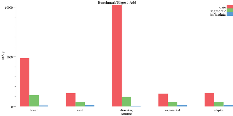
ns/add operation
You can find lots more documentation on the benchdraw github page.
Correctness results Link to heading
The correctness of an implementation’s approximation algorithm depends a lot on the nature of the data and the quantile we’re looking at. Plotting all the data at once, without axis modifiers, shows there are clear outliers in the segmentio and influxdata implementation that make it difficult to compare. For all correctness results, lower (a smaller % difference) is better.
benchdraw --filter="BenchmarkCorrectness/size=1000000" --x=digest --y=%difference < benchresult.txt > pics/correct_allquant.svg
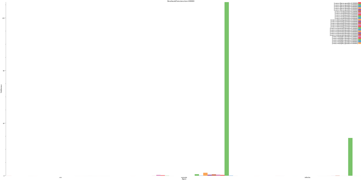
% difference for every dimension
We can filter this down to just the 90% quantile. Here we see the tailspike distribution causes problems for both the segmentio and influxdata implementation.
benchdraw --filter="BenchmarkCorrectness/size=1000000/quantile=0.900000" --x=source --y=%difference < benchresult.txt > pics/correct.svg
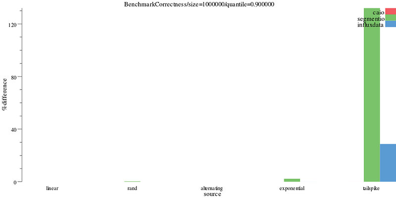
% difference on the 90th percentile
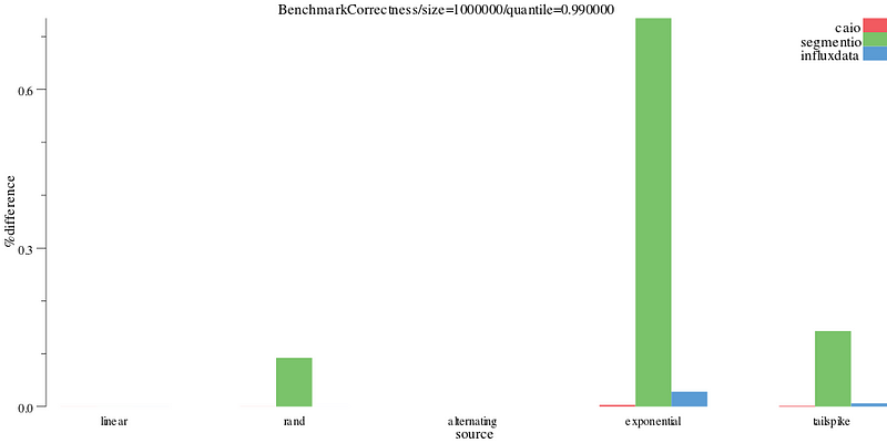
Things look a lot better on the 99th percentile (the Y axis goes from 120% to .6%), but segmentio and influxdata’s correctness implementation is still outperformed by caio’s.
benchdraw --filter="BenchmarkCorrectness/size=1000000/quantile=0.990000" --x=source --y=%difference < benchresult.txt > pics/correct_99.svg
% difference on the 99th percentile
We can break down the graphs per tdigest implementation to see how they perform at each quantile. We see segmentio’s tailspike distribution performs poorly on the 90th percentile.
benchdraw --filter="BenchmarkCorrectness/size=1000000/digest=segmentio" --v=3 --x=source --y=%difference < benchresult.txt > pics/correct_segment.svg
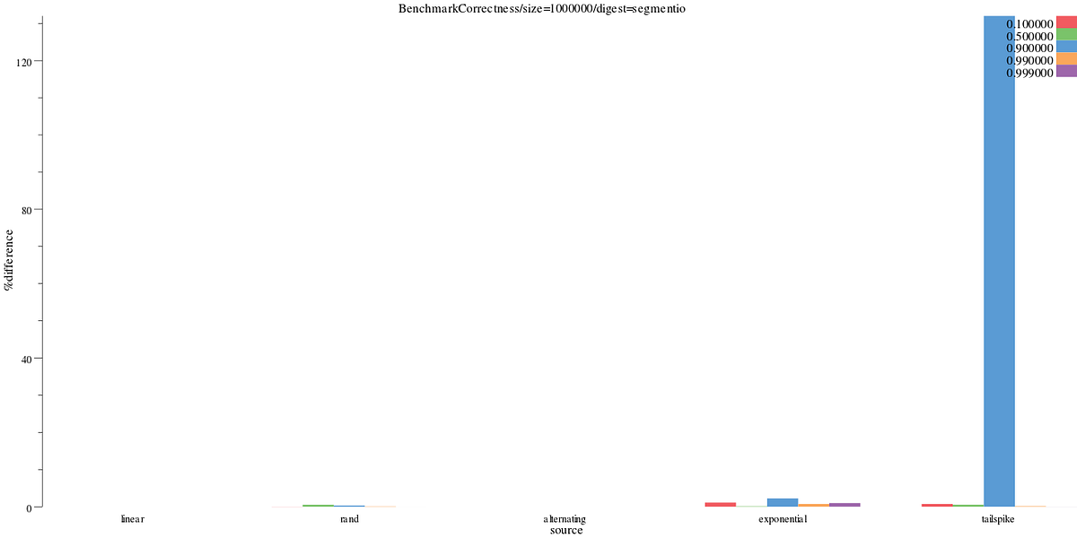
Segmentio’s % difference
Influxdata’s implementation has a much smaller Y axis (cap at 30%), but still performs worse than normal on the 90th percentile.
benchdraw --filter="BenchmarkCorrectness/size=1000000/digest=influxdata" --v=3 --x=source --y=%difference < benchresult.txt > pics/correct_influx.svg
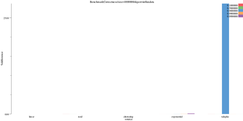
Influxdata’s %difference
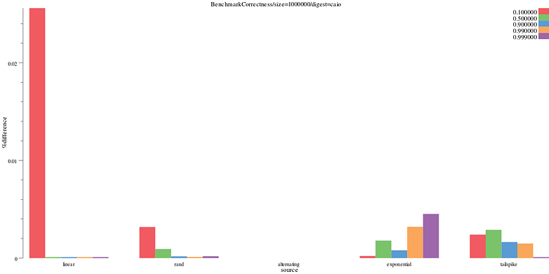
Caio’s implementation does a reasonably good job at all data sources and quantiles, with a Y axis that caps at .03%
benchdraw --filter="BenchmarkCorrectness/size=1000000/digest=caio" --v=3 --x=source --y=%difference < benchresult.txt > pics/correct_caio.svg
Caio’s %difference
Since none of the implementation’s do particularly poorly on the exponential distribution, we can narrow down into just that series of data to get results that may be more typical. Here we see segmentio’s implementation has a much larger % difference than either of caio or influxdata’s.
benchdraw --filter="BenchmarkCorrectness/size=1000000/source=exponential" --v=3 --x=digest --y=%difference < benchresult.txt > pics/correct_exponential_all.svg
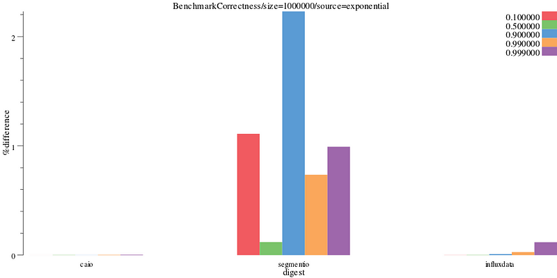
Exponential results
Looking at influxdata’s implementation we can see it perform progressively poorly as the quantiles increase.
benchdraw --filter="BenchmarkCorrectness/size=1000000/source=exponential/digest=influxdata" --v=3 --x=quantile --y=%difference < benchresult.txt > pics/correct_exponential_influxdb.svg
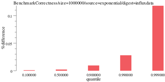
influxdata results
For caio’s implementation, it performs well across many quantiles.
benchdraw --filter="BenchmarkCorrectness/size=1000000/source=exponential/digest=caio" --v=3 --x=quantile --y=%difference < benchresult.txt > pics/correct_exponential_caio.svg
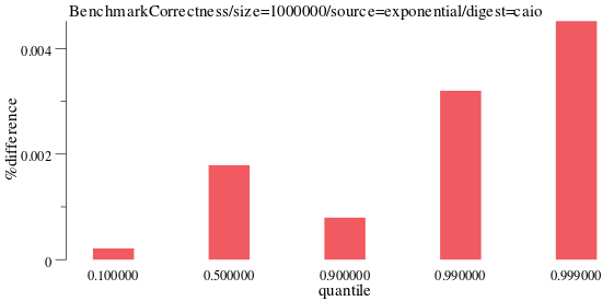
caio results
Explore the data yourself Link to heading
You can explore the exact data used and benchmarks at https://github.com/cep21/tdigestbench. Learn more about benchdraw itself at https://github.com/cep21/benchdraw.